New Zealand Tourism
Transport & accommodation booking web-app
GETTING STARTED
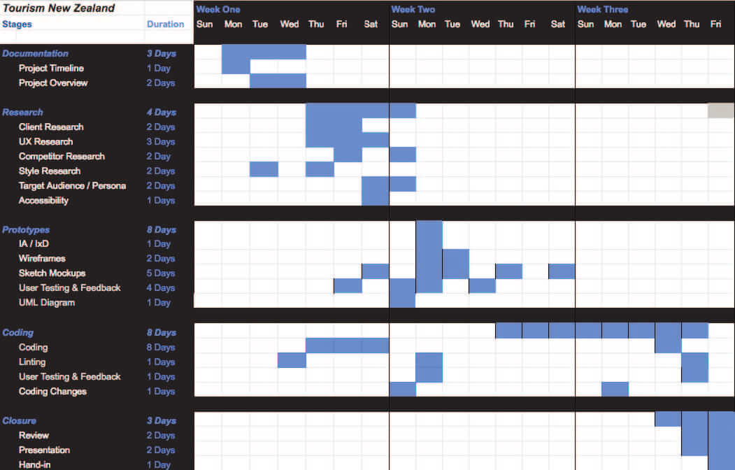
The project timeline consisted of 3 weeks, which I've prioritised 5 key tasks. They are divided between:
Documentation
Research
Prototyping
Coding
Closure
Research
Tourism New Zealand is the organisation responsible for marketing New Zealand to the world as a tourist destination. The major tool we use to do this is the 100% Pure New Zealand marketing campaign, a campaign that has evolved over the past two decades to make New Zealand one of the world's most well-respected tourism brands.
International tourism has grown to become New Zealand's largest earner of foreign exchange, pumping around NZD14.5 billion annually into the nation's economy. Over 3.7 million visitors arrive in the country every year. (updated December 2017)
Research
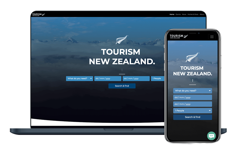
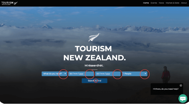
Web designing a single page web application, which is responsive for all type of devices, they have a new campaign that is aimed at visitors staying for short periods, booking their own accommodation and arranging their own transport. A single page web application which allows users to input information, and provide feedback with Accommodation or Transport options, calculating their cost and displaying the price and a payment option.
For this project we’ve chosen to do Transport and Accommodation to help their needs in one go, so they can book their vehicle & the place of stay within one website.
DESIGN
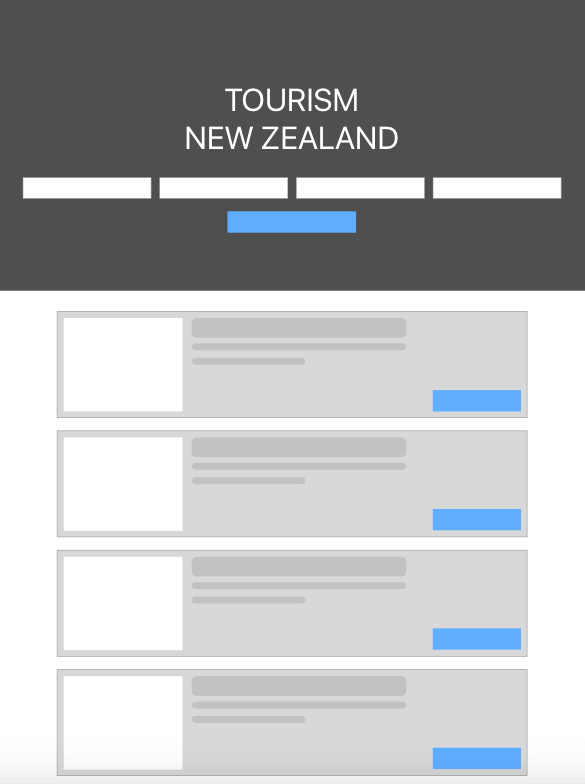
I've started to do some research about the competitors, we came up with a Low-Fi sketch.
Tried to solve the problem of ordering both Accommodation & Transport at the same time.
With this wireframe I concluded that two inputs would be used from Accommodation & Transport, and the other two for dates before/after.
Sometimes the users click accidentally, so we've added a button called "Search" to activate the search results.
DESIGN
The UML Diagram is pretty straight forward, which shows the user how would use it.
The key element for the user was the search, find and funnel the path to the pay options.
For best user experience, we've used this UML Diagram to show the potential of simplifying the website into a better user experience website.
Research
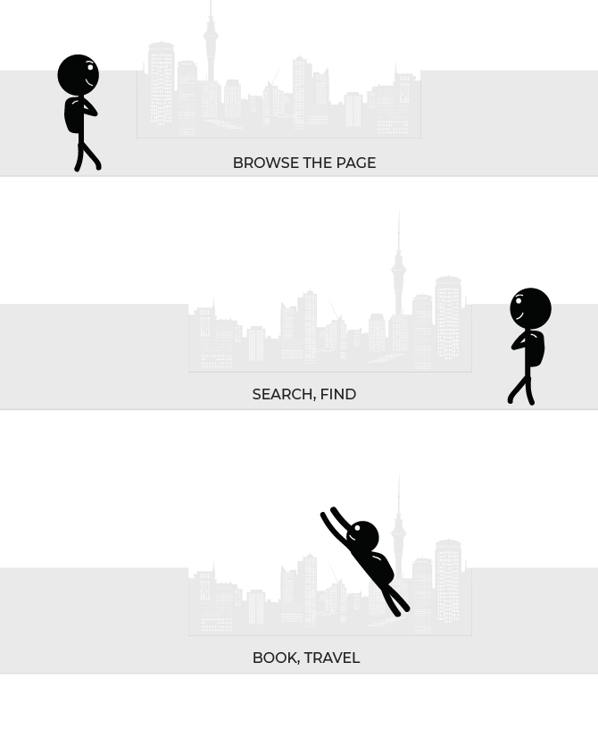
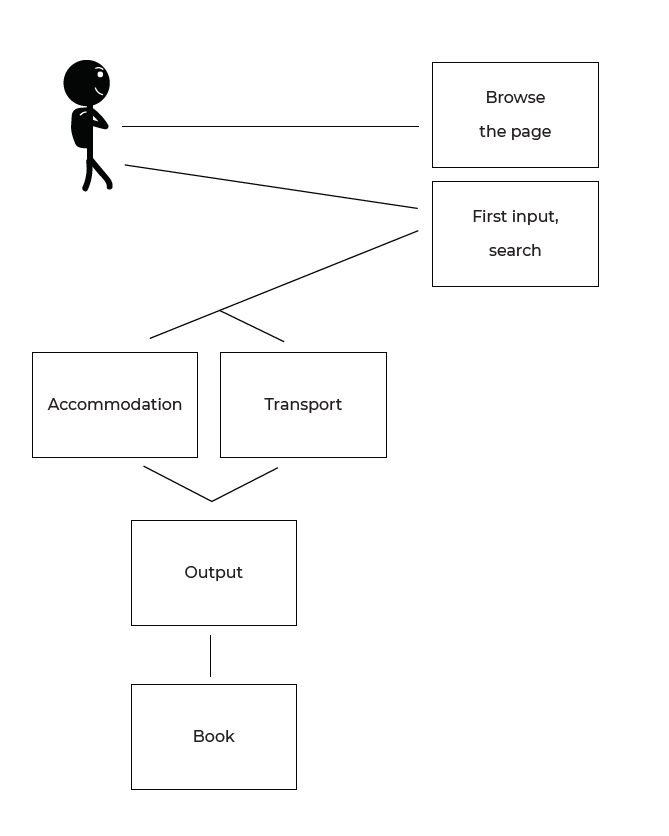
Information architecture was needed to show the roadmap of the User. Which consisted of browsing the page, then inputting some data
Then from the input, to expect an output from Accommodation or Transport and then booking the accommodation/transport.
Research
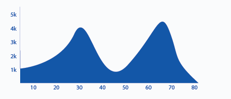
By the result of the search of user researching for Tourism New Zealand I’ve found out that mostly users from overseas will be using this app, and their language varies from place to place.
People aged 18 to 33 - 80%
People ages 33+ - 20%
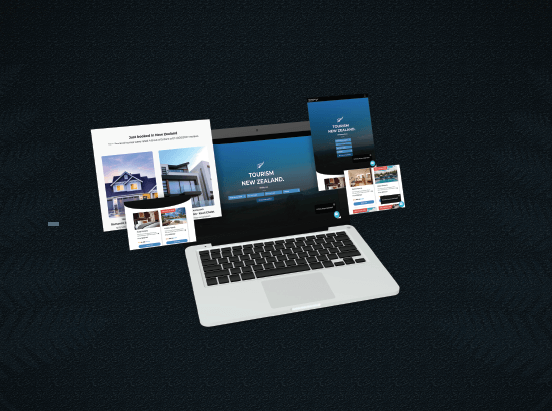
The stats are important when pre-developing the project since it gives an overview of the age group and the type of users which will interact with it. Overseas visitor arrivals are increased by 9 percent since 2015. New Zealand is known for beautiful places to visit, and mostly backpackers will use the website, so for that matter the website is responsive for Mobile, Tablets and Desktop, and every file is minified to help their needs to download / see the website.
DESIGN
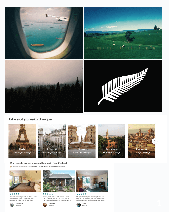
Moodboard was helpful along the way which we've included some images of planes, lands, New Zealand's fern and some booking/travelling websites.
Inspiration of the cards came from various websites e.g AirBnb, Contiki, Expedia etc.
Research3
Tourism New Zealand is a highly valuable website & has a great brand and trust since it’s connected with the government, which allows users to book & shop freely without stress.
Weakness of Tourism New Zealand is that the competition of the other companies are focused for this campaign’s needs, which causes a problem for other customers to shift between other websites and Tourism New Zealand’s one.
Opportunities of Tourim New Zealand are extendable to a grade which not only the company is responsible for the NZ tourism but can offer many of the cheapest and best accommodation and transport for their customers.
As New Zealand has bus tours and they offer accommodation and transport within the same package, some travellers especially backpackers might choose those companies to travel, because of the safe way to book everything at once.
DESIGN
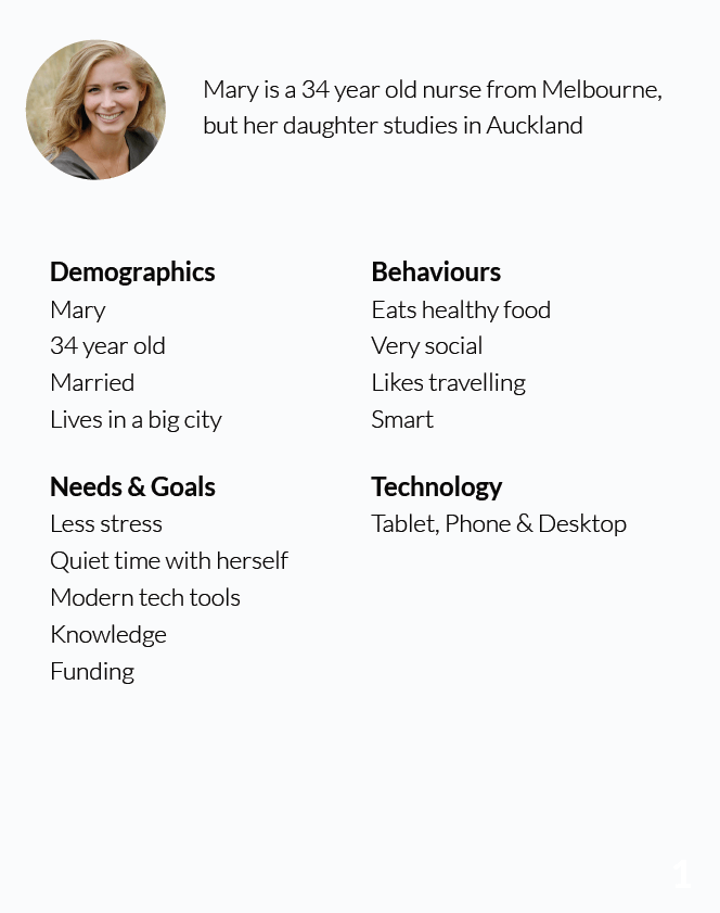
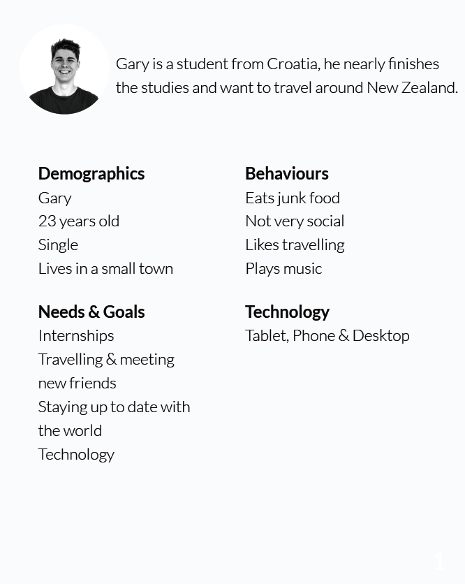
Persona demonstrating the demographics, behaviours, needs & goals, technology used from this persona.
DESIGN
Persona demonstrating the demographics, behaviours, needs & goals, technology used from this persona.
Research
Website is responsive, have deals and flights on sale - which I’ve thought to put it also in our website but their aim is globally helping kiwis to send people through Europe and other continents, so the only way to make their competition level lower was to make it more about New Zealand and make it that way that people from other countries can change their language, which House of Travel doesn’t have.
I’ve chosen House Of Travel as a competitor to analyse owing to Tourism New Zealand and House Of Travel having a similar product and a similar target audience.


Research
WSimilar to House of Travel, STA Travel ofers flights round the world and is focused on flights, hotels, tours and insurance. They have stores New Zealand wide, and have newsletters which lets them subscribe and get offers and deals by this company.
For this reason, Tourism New Zealand offers a checkbox which asks for permission to receive letters from NZT. I’ve chosen STA Travel as a competitor to analyse owing to Tourism New Zealand and STA Travel having a similar product and a similar target audience.
Research
From the usability testing I saw that mostly the users know what to click and how to interact with it, but instead of making the image static I’ve decided to make it a carousel so they can change the image.
Research
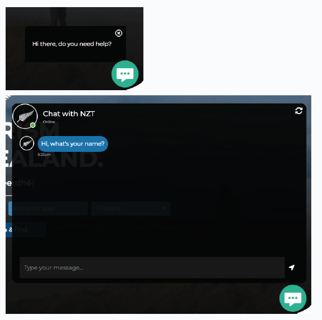
Creating a website the majority of users that I’ve researched will be using tablets and phones and they would want to chat for their options rather than searching on the input and around the web, making it easier for them to get to the final results and choose between the cards.
Research
When it comes to paying, we want to be very secure & confidential to keep every credit card / password safe. And for accessibility reasons we added the “cursor - help” when they hover into the CVC section.
Since this website has to be accessible for anyone, and the language they choose will be read to them in any language for people with hearing impaired.
Design
Research
All images are used from:www.pexels.com
iPad and iPhone mockups:
https://www.mockupworld.co/free/iphone-and-ipad-presentation-mockups
https://creativebooster.net/collections/all-freebies/tablet
http://www.mediafire.com/file/kbp90ju7g5tr499/FreeMacbookProMockup.zip
https://pngtree.com/free-icon/print_38507
Chat Icon
http://icons-for-free.com
Descriptions and copywriting
New Zealand Tourism & AirBnB