Airways New Zealand
Operational tool UI/UX Design process
GETTING STARTED
Airways New Zealand contacted us that needed a better solution of how they find information in their physical documentation.
The UX Designer interviewed more than 20 potential users ranging from Air Traffic Controllers, product owners and project managers.
We didn't limit ourselves to only Traffic Controllers manual, we took examples from medicine/engineering documentation as well.
User Experience
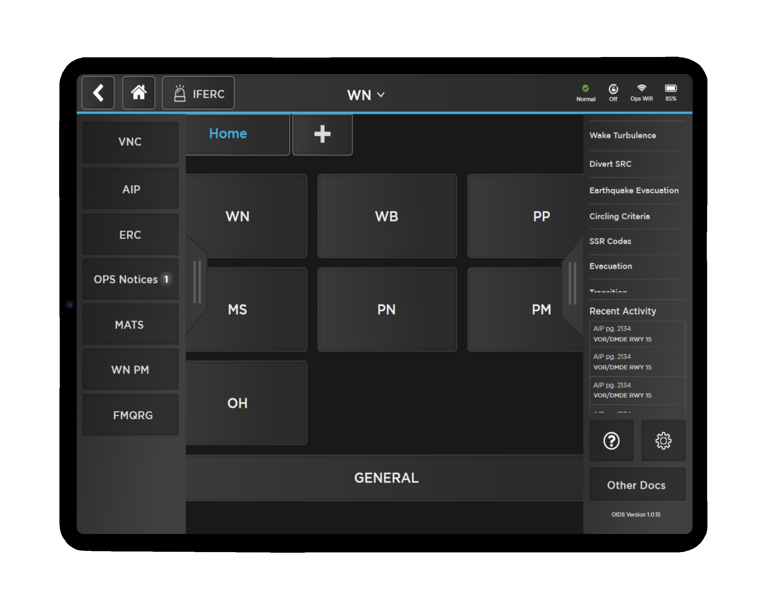
Physical documentation that Traffic Controllers used were too specific for their location and they wanted a quicker solution to switch between other tools such as weather, radar screens to assist aircrafts and the application had to be an application which could only connect securely to their network.
Many Air Traffic Controllers were very familiar with the physical documentation and they knew exactly where to look when the coordinates were provided by the pilot, but they needed a faster solution, a digital solution.
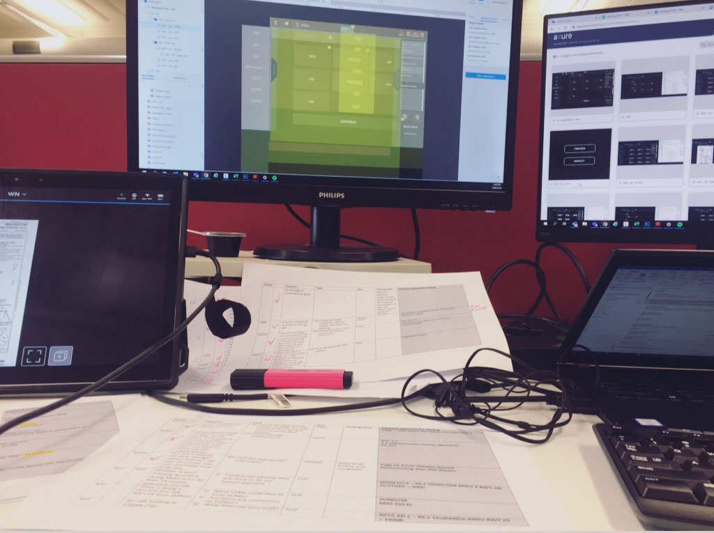
The team worked to a tight 7 week deadline to deliver a design solution which would then be tested and functional/usable by Airways.
Project
The UX Design lead conducted 26 interviews with Controllers who represented the 7 air traffic sectors in New Zealand and observational analysis inside the radar centres They also reviewed previous concepts and conducted competitive design research
The team then created a user journey, and three low fidelity concepts for feedback and verification with a similar group of controllers/project stakeholders in order to facilitate design/solution preference
Reviewing all feedback, an initial prototype was created and tested with controllers using task cards, moderated by theta’s UX lead We outcome was then turned into a high fidelity design and prototype
DESIGN